
24/04/2017
Now that I have begun to the production side of my unit, I have come across a lot of problems, just within the first hour of starting.
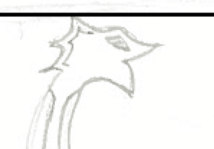
When I was doing the line work of my illustrations, I noticed that the perspective was off in most of the sketches, me having to move certain objects to the side. One of the biggest examples was the sword in Chapter Six, that is impaling Gunnar, the two sides of the sword does not match up. But it is not the only perspective that needed to be altered. The style choices I picked did not suit the whole of the illustration, looking almost childish in comparison.
This was the original ship head, and as you can see it does not look as good as I anticipated, looking very childish and not as detailed as I hoped it would be. Now that I am doing these sketches on Photoshop it is much easier to alter them and if I make a mistake I can always undo, unlike if I was actually drawing. I would have to keep rubbing the drawing out, then re-drawing but that can mess up the paper, leaving marks behind.
This is the improved head and as you can see it has improved a lot from its original design. Unlike the first drawing you can see for what I was going for: a dragon. But it does still need improvements. I will alter the head when I come to do the colouring.

I have also been faced with another practical problem when I was doing my line art. I drew a picture of the main character Gunnar – as it is relevant to the story. but he does not look right. For his age (50/60 years) he looks too young. I may have to do more sketches of Gunnar until I get an image I think is relevant to my character. I want to make him look strong and vicious, with a hint of age – a weakness to the powerful Gunnar Baardsen
04/05/2017
I decided to test the shade of colour I could make Elmer’s hair in Chapter Three – this is before he dyed his hair blonde in Chapter Seven. When the event of Lindisfarne happened, I described Elmer’s hair as being a “Rich brown” So in photoshop I decided to replicate the shade I described. It did take awhile as I was trying to pick the right colour for my character as I want it to be how I imagined it, but I finally found the right shades.
However, when I finished colouring the strands with the dark brown, I thought it would be a good idea to put a softer brown over that base. But what it did was look as if an unknown light source is reflecting off his hair. To correct the mistake, I will go over it with the dark brown that I originally painted the strands in. I may lower the opacity of the lighter brown, maybe that will make it look less harsh.

17/05/2017
What I decided to do today was make work on Elmer’s belt, maybe adding detail depending if I finished within the time limit I set myself. So, I managed to excel my task (though it wasn’t hard) and made work of adding colour to his belt. However, the colour I selected was too bright

The contrast of the brown to the vivid orange was too striking and definitely not what I envisioned when I decided to select this colour. Adam, another student in my class, suggested that I do to a more bronze/brown colour to make it fit perfectly with the brown; so I did that exactly. Honestly, the results are excellent, though I have not added shading and additional detail (making the buttons shine and look metallic)
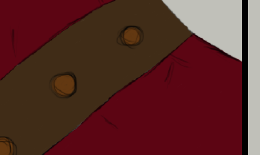
Making it darker definitely made it look more aesthetically pleasing.
I decided to move on and made work of Elmer in Chapter Seven where he is tied to a wooden pole and sentenced to burning. And if you can see the eyebrow and eye are completely out of place – both too large for his thin face. I decided to make a few changes. Originally I was not going to change his eye, deeming it perfect for my character, but then I realised if you are aged your eyes intend to droop downwards, while Elmer’s eye looks very youthful, unlike his age of 60-70

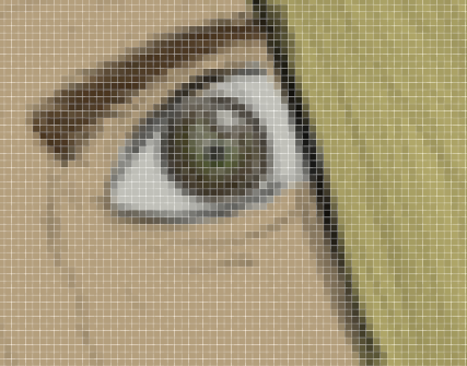
Here is the developed change, though the problem still occurs that his eyes still look youthful, less now that I have added the soft detail of his wrinkles. I used a soft, low opacity paintbrush to achieve the wrinkles, wrinkles never being too defined but a small detail of excess skin. Yet, the eye makes him look much younger than he would be during this time. What I also decided to do was change his eyebrow, being far too off than an eyebrow should. This was a very simple process, also, but very effective. First I did a quick sketch of the shape of the eyebrow with a pen-pressured black paintbrush, drawing until I found a shape I am happy with. Then I put a layer beneath and began painting it brown – the original hair colour of Elmer.

Here is the updated eye and I am definitely happy that I decided to
22/05/2017

05/06/2017

