
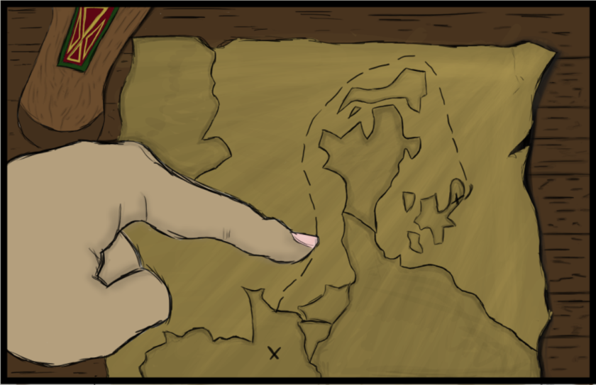
This piece of concept art is probably the most aesthetically pleasing to look at. I asked several people around my class if they enjoyed the look of this illustration, to which all said yes. What makes this illustration so striking amongst the other pieces is the map. The map is the focal point of the picture, as documented in the book when Gunnar points to it, following the trail from Denmark to France; an attack. How I got the map to look like that was very simple and did not require me to use a lot of tools. All I needed to do was change the opacity and the colour, making faux light spread across the map. What gave me the inspiration to do this sort of style (The map is drawn on cartridge paper) was the Skyrim map you get with your console game. On the outline of each island, they added a dark line – low opacity – and begin filling it in with a lighter colour, also low opacity. To me, it makes the map look old-fashioned, not boring as I was originally going to just do one colour; I am glad I had the Skyrim map on hand.
This illustration was the one that held the most detailed and looked great all across, without one part of it being detailed while the rest is very 2D and doesn’t hold that much character. What I will say that could use a bit more work is the hand. The shading I used on the hand to make it a bit more realistic only semi-worked. When I do skin shading it is mostly on the face, so I have a lot of experience with that; the hand is a completely different story. To make sure I have the most accurate version for this I could of replicated this image, holding my hand in a certain way and using limited lighting, similar to how it would be on the illustration.
