
As I stated in my brief, I was going to make a ‘series of A2 posters’; I half completed this task I set myself. Instead of making a A2 poster, I decided to make these several posters A4/A3 as it will not only be easier for me, giving me the chance to work on other experimentation and develop my skills as a creative.
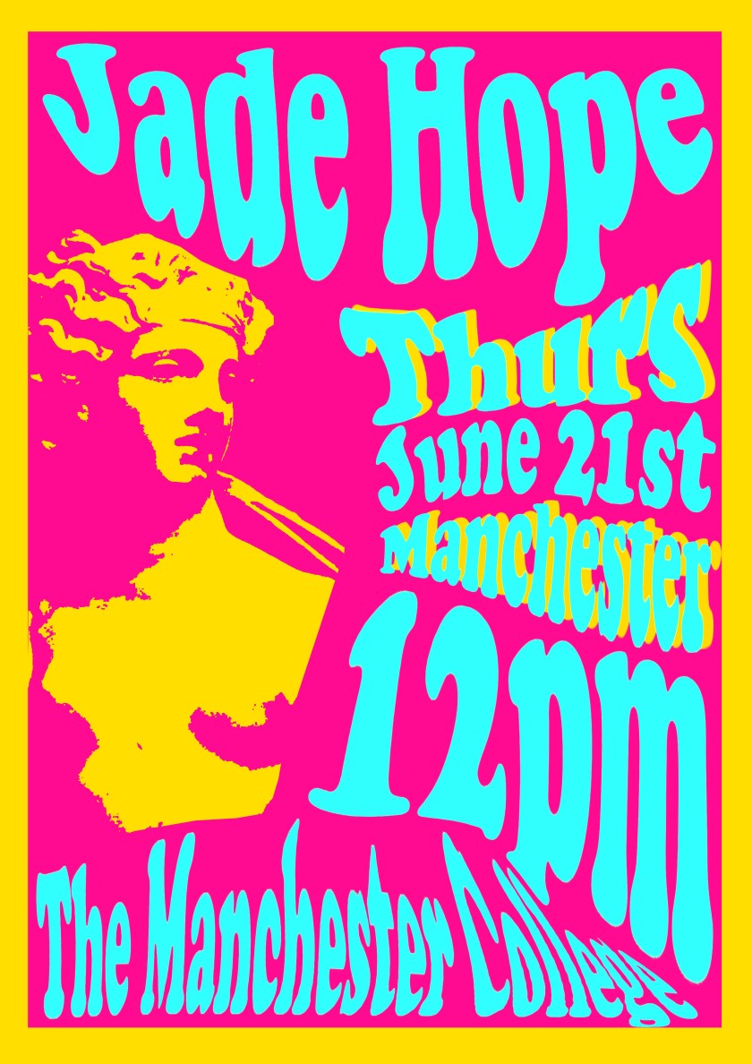
This poster definitely pieces all the work I have created for this project together, combing the classical sculpture with the psychedelia of the posters that I have researched continuously and have found throughout the weeks of doing this project.
However, what would be interesting and could be an add on for this poster (and would add to what I stated in the brief) I could use different models to be on the poster: John Lennon, Jupiter, Venus, Mick Jagger or any classical sculptures (that I gathered from my primary research trip)
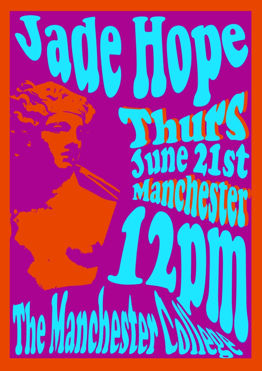


This was the original variation of the poster I created, being inspired by the interesting colour palette that Victor Moscoso uses in his own work; vibrant orange, red and blue – though the blue intends to edge more into ‘baby’ blue territory, instead of Moscoso’s ‘Royal’ blue I really love the harmonious way in which the red and orange intertwine nicely together to make the classical icon appear fiery, taking the spotlight on the poster. The blue lettering works to complement the red and orange, making the words almost bounce off the page to catch your attention. The additional orange highlight behind ‘Thurs’ and ‘Manchester’ make the letters stand out more than their counterpart, causing your eyes (subconsciously) to follow the text to see what the poster is documenting.


The way the blue – even though the colours are harmonious – stands out against the very vivid purple background, making the baby blue text stand out. I am not really a big fan of these colours, but it does link nicely with the psychedelic theme I am aiming for with my project. However, what could make this this poster look more aesthetically pleasing to the eye is by maybe picking a more somber purple – not too vibrant you almost have to look away to stop your senses being assaulted by such an intense colour palette. 
