Friday 13th October
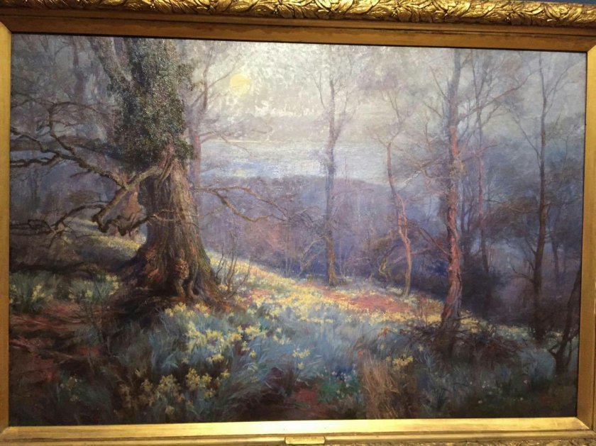
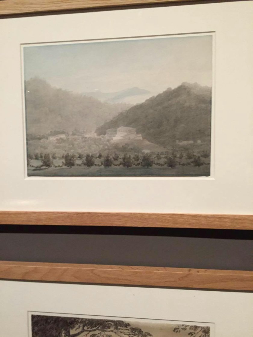
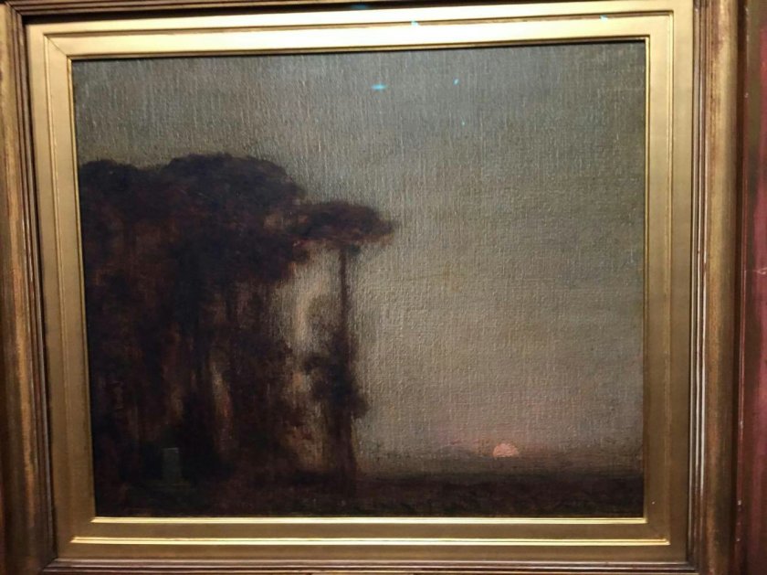
Today I decided to begin decorating one of the pages of my sketchbook, ready for when I stick in my primary research from our trip. My first initial plan was to stick in the pictures and write down why I selected these pictures and how they are going to help me in the future; it is a very plain idea, but it will get across the idea of why I selected these specific objects as my inspiration.
Then I found my old water-paints and got the idea to paint the page to add some character. But I wasn’t going to use bright colours – most of the pictures I selected contain quite dark tones, so making the page vibrant would not suit the primary research purpose. I chose a dark blue/indigo and a dark green; both colours compliment each-other perfectly, it will make the pictures stand out.
Instead of doing precise brush strokes, making it look even and neat, I decided to do it messily to give it that artistic vibe. Yes, having a nice, neat sketchbook with pictures aligned perfectly with each-other is quite nice, but adding character to your pages is much better.

However, when I was adding the water colour to the page, I decided to add some orange – I wanted to make some sort of contrast, but it didn’t go so well.
The colour stood out too much against the green and blue – it would not match the theme of the page, but that is what you do; you test around, see what works and what doesn’t and then you change it – or keep it if you liked it.
Sunday 28th October
I decided to use the water coloured painted page to present Raqib Shaw’s work as his colour theme is much better suited to the greens and blues I have used on the page. But I did debate whether to frame the secondary pictures of his work – make it stand out against the vibrant page, or leave it without the border.
When I made a border for one of my pictures and put it up against the page, it did not look right and almost out of place. Then, when I decided to place my picture down without the border, it worked instantly – the colours from both the page and the picture working harmoniously and also complimentary. Seeing the orange from the work intertwine with the blue of the page definitely brings the picture forward – instantly catching your eye and making it stand out.


