
As I have now finished Sarah Quinn (technically) I decided to play around with how I would like to present her in the booklet that me and Shannon are going to create and the final piece. I decided to get feedback off my peers on what which filter they liked the most, which one they would preferred in the booklet, some criticism and finally what the picture makes the feel. I will make a final decision
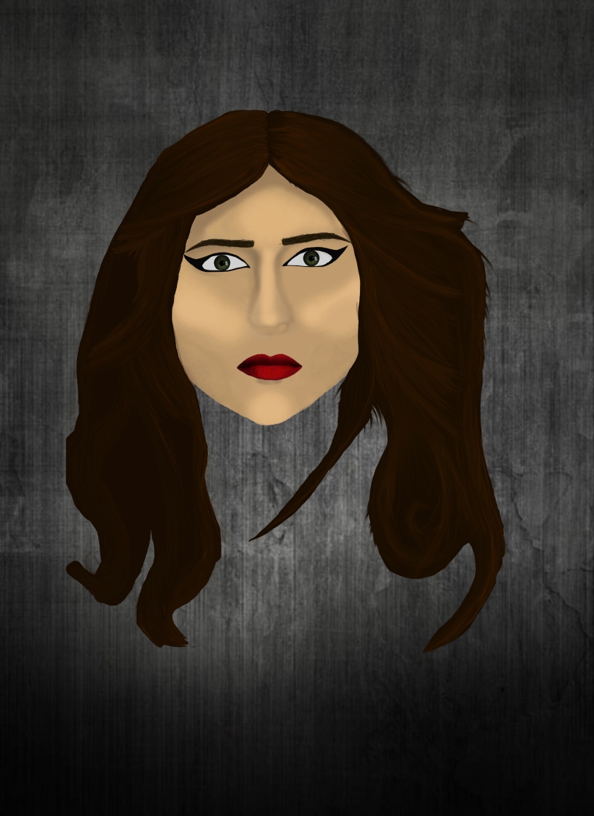
Normal Sarah 
Me – What I enjoy most about this graphic that I have created is the way all the colours mix in together — greens and browns mix perfectly together. The way I have shaded the hair makes it look quite realistic and how I reflected the light gives it the sense of realism. However, something that I do not particularly like is the shading on the skin, but I do not have enough skill to get skin that looks like it belongs to a person in real-life. Something I would change about this is maybe spend more time on the eyes; add some slight shading and a tear duct to make the eyes seem not that flat.
Shannon – You can see more detail in her eyes and her hair; colours standing out vibrantly amongst the background and skin. Her lips are the brightest colour on the graphic, drawing the viewers eye and making them stand out amongst the dullish shades.
Lachlan – Like the shading on the face, gives her more depth and more realism. Hair looks lovely because of the detail of the different shades of brown and how it actually looks like strands of hair. The lips are vibrant and stand out on the picture — I like it.
Tim – I like the hair and the eyes the most — the eyes are shaded correctly and it looks like you put a lot of detail and time into the hair. Would suggest to improve the light parts of the skin stand out a bit too much.
Black and white Sarah

Me – I do prefer this version over the coloured version as you cannot see the mistakes I have made. It gives that sense of despair that the coloured version could not get across — the colour made her seem quite tranquil, something I did not really want to get across the the audience. The black and white version makes her looks anguished, as if something bad has happened to her; that’s the picture I want to get across.
Shannon – The black and white version is much creepier than the coloured version and fits strongly with our theme; horror. Without the colour she seems more mysterious — you don’t know who she is, making the character bio the only thing that defines her
Lachlan – Reminds me of a noire movie, empathise the shading on her face. You can concentrate more on the character without the distraction of the bright colours.
Vibrance Sarah

Me – I like the shade of skin she is, it gives that extra vibe of horror. Her lips are also a nice shade of pink. What I do not like about this version is how it makes it look quite foggy and faded, like I just added a faint grey layer over the picture. I have fully decided I will not using this as a final piece or put it in the booklet.
Shannon – It looks creepy without losing all the colour. She looks unhealthy (malnourished) like she has been kidnapped for awhile. The shading is clearer than the black and white version. Her eyes are not as appealing as the eyes on the other versions, making her seem completely dead.
Me – I do not really like the way the filter looks on Sarah, most likely due to shades of her skin and how red her lips were on the original painting. I do like like the colour of her eyes. Why I would not use this in the booklet or as a final piece because it does look like a filter is over it — a bit too thick for my own liking. However, maybe if I changed the curve and made it slightly higher it would look decent enough to be presented enough in the booklet.
From the feedback and my own opinions of the different versions of Sarah with the filters its obvious the black and white version and the normal version are the most popular choices. The black and white version fits perfectly with the theme of the booklet as our group are going for the more mysterious/horror style, making a black and white theme much more fitting than colour. If I were to change the black and white version I would maybe make it slightly lighter, but make the red in the picture much darker (lips and parts of the hair) to make it appear black, adding more of an asset to the horror genre.
